Introduction to Probability Models
Lecture 38
Qi Wang, Department of Statistics
Nov 28, 2018
Revision
- Five Number Summary: Min, Q1, Median, Q3, Max
- Boxplot is a graphic depiction of the 5 number summary
- IQR = Q3 - Q1
- Outlier bound: $Q1 - 1.5 \times IQR, Q3 + 1.5 \times IQR$
Time for Quiz
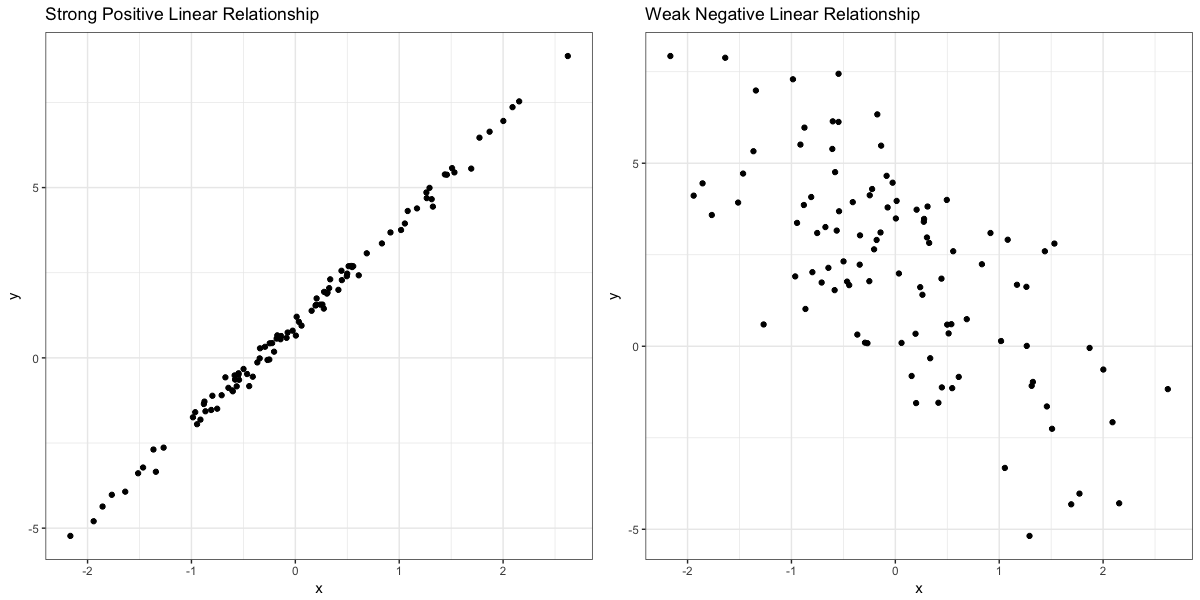
Association/relationship
- May be positive, negative or no association
- Remember: Associaton or correlation is NOT the same thing as causation. Just because two variables are associated doesn’t mean that a change in one variable causes a change in the other.
- Two variables are associated (or related) if some values of one variable tend to occur more often with certain values of the second variable. For example, both tend to be high or low together (positive association), or if one is high then the other is often low (negative association).
Response variable
- Y(plotted on the vertical axis)
- Dependent variable
- Measures an outcome of a study
Explanatory variable
- X(plotted on the horizontal axis)
- Independent variable
- Explains or is related to changes in the response variable
Example 1
Which is the explanatory variable and which is the response variable?
- The amount of time spent studying for an exam and the grade on the exam
- The weight in kilograms and the height in centimeters of a person.
- Yield of corn in bushels per acre and the inches of rain in the growing season
Scatterplot
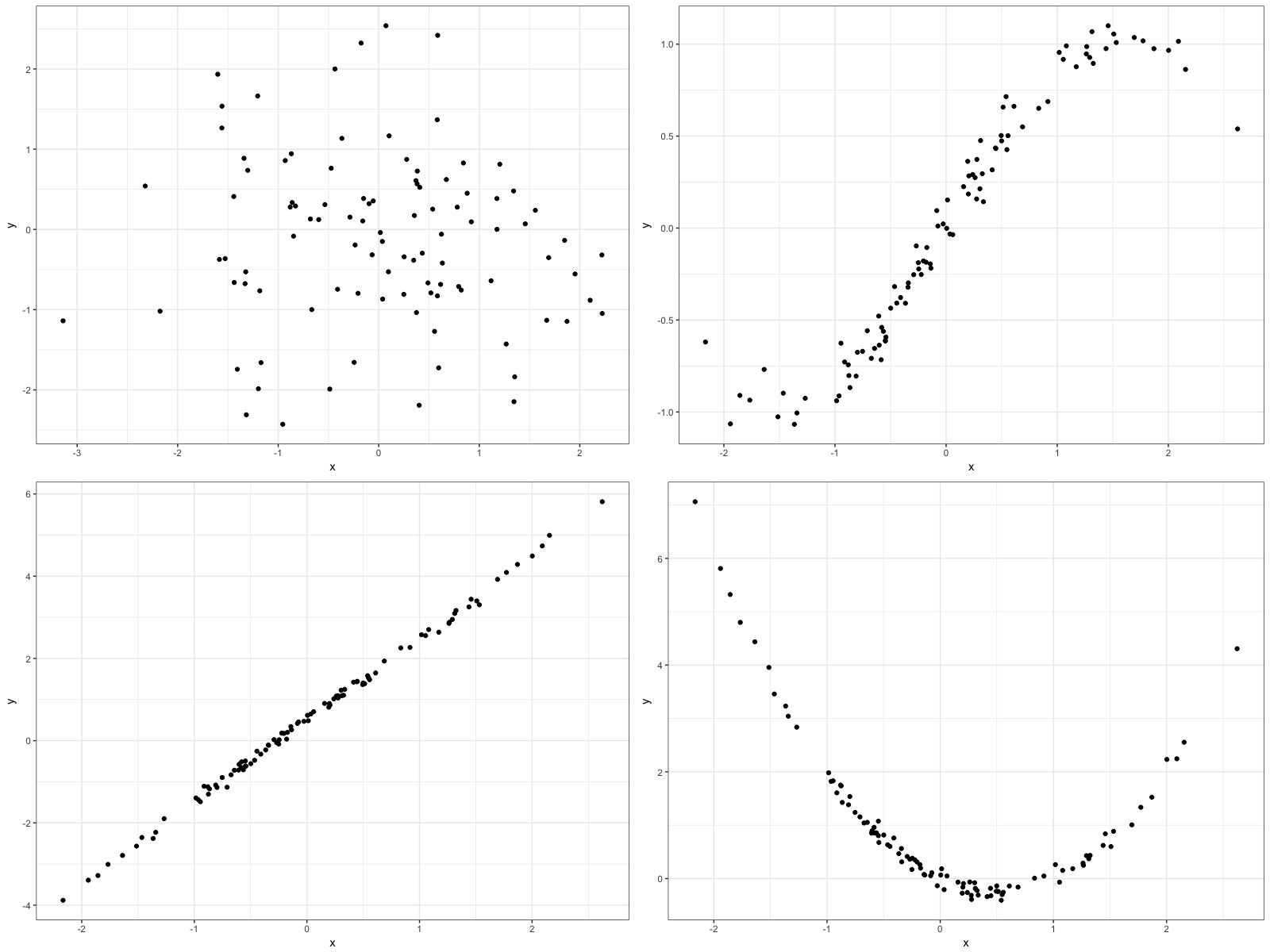
Scatterplot
We often use Scatterplots to visually predict if there is a relationship between the quantitative variables.
- Show the relationship between 2 quantitative variables measured on the same individuals/elements
- Dots only—don’t connect them with a line or a curve
- Form: Linear? Non-linear? No obvious pattern?
- Direction: if linear----positive association, negative association
- Strength: how closely do the points follow a clear form? Strong or weak or moderate?
- Look for OUTLIERS!
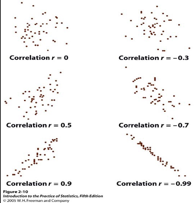
Strength of Association
The strength of the relationship between two variables can be seen by how much variation, or scatter, there is around the main form.
Correlation
To better describe a linear relationship that we see in the scatterplot, we will look at correlation
- Correlation: measures the direction and strength of the linear relationship between 2 quantitative variables.
- $\rho$: Population correlation
- $r$: Sample correlation
Properties of Correlation
- $-1 \le \rho \le 1$
- Sign is same as the slope of the best fit line
- Both variables must be quantitative!
- Must have a linear relationship, but which variable you call x and which you call y does not affect correlation
- Correlation is the same even if you change the units of measurement
- Outliers can affect correlation (removing it will increase the correlation)
-
Correlation strength:
- $|\rho|=1$, perfect linear relationship (doesn’t happen with real data)
- $0.8 \le |\rho| < 1$, strong, linear relationship
- $0.5 \le |\rho| < 0.8$, moderate, linear relationship
- $0 < |\rho| < 0.5$, weak, linear relationship
- $\rho = 0$, no linear relationship (may be a random scatter or because there is some other non linear relationship)
Correlation